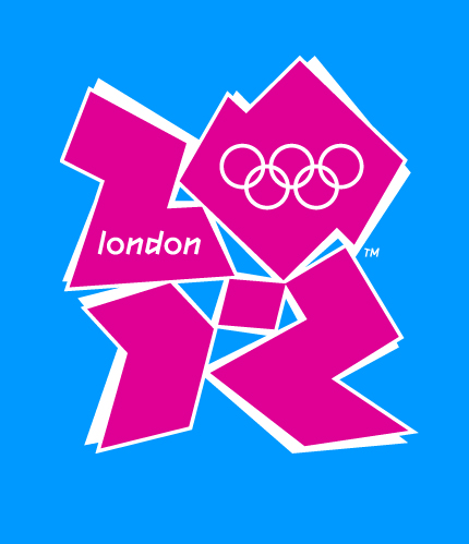
London 2012 Brand Backlash

It’s not often that design gets the level of press coverage that it truly deserves, and when it does, it’s usually negative– as is the case with the hub-bub surrounding the recently announced identity for the 2012 London Olympics. Almost 50,000 people have signed an online petition to have the logo– designed by Wolf Ollins at a cost of $800,000– changed, and there have been reports of animated versions of it causing epileptic seizures.
Personally, I think the brand is atrocious. Not only does it not evoke ‘London,’ but it also fails to convey anything but clashing colors and meaningless abstraction. But I’m just a lowly design student, so let’s see what other people are saying.
Love it:
Coudal Partners – Just like you, our first reaction was shock. But we talked about it all morning. By 3pm, we decided we love it. And here are ten reasons why you should, too:
The Serif – It’s got that Marmite factor. But we find that even with things that people start off disliking, they get used to them.
& …it’s incredibly noticable, brave and confrontational.
Hate it:
Seth Godin – A great logo doesn’t mean anything until the brand makes it worth something.
Design Observer – The London 2012 logo is a solid gold stinker.
Ambivalent:
Speak Up – I believe, despite any ensuing boo’s, that this is some of the most innovative and daring identity work we have seen in this new millennium, and the lack of cheesy and imagination-impairing gradients gives me hope that identity work can still be resurrected on a larger scale.
It was only when discussing the image with my mother was I able to glean some meaning from the spilled tangrams.
At least this shows that there was some reasoning behind the brand other than abstract PR nonsense.


“London 2012 Brand Backlash”