London 2012 Brand Backlash

2012 Olympic Identity

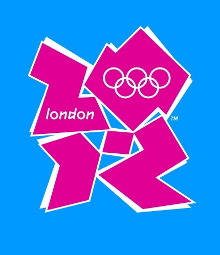
It’s not often that design gets the level of press coverage that it truly deserves, and when it does, it’s usually negative– as is the case with the hub-bub surrounding the recently announced identity for the 2012 London Olympics. Almost 50,000 people have signed an online petition to have the logo– designed by Wolf Ollins at a cost of $800,000– changed, and there have been reports of animated versions of it causing epileptic seizures.

Personally, I think the brand is atrocious. Not only does it not evoke ‘London,’ but it also fails to convey anything but clashing colors and meaningless abstraction. But I’m just a lowly design student, so let’s see what other people are saying.

Love it:
Coudal PartnersJust like you, our first reaction was shock. But we talked about it all morning. By 3pm, we decided we love it. And here are ten reasons why you should, too:

The SerifIt’s got that Marmite factor. But we find that even with things that people start off disliking, they get used to them. & …it’s incredibly noticable, brave and confrontational.

Hate it:
Seth GodinA great logo doesn’t mean anything until the brand makes it worth something.

Design ObserverThe London 2012 logo is a solid gold stinker.

Ambivalent:
Speak UpI believe, despite any ensuing boo’s, that this is some of the most innovative and daring identity work we have seen in this new millennium, and the lack of cheesy and imagination-impairing gradients gives me hope that identity work can still be resurrected on a larger scale.

It was only when discussing the image with my mother was I able to glean some meaning from the spilled tangrams.

At least this shows that there was some reasoning behind the brand other than abstract PR nonsense.

Free Download: 2007 Skylines Calendar

Skylines Calendar

In celebration of International Pixel-Stained Technopeasant Day, I have decided to make public the work of which I am most proud, a 2007 calendar featuring the skylines of 6 beautiful international cities.

About IPSTD:

On this day, everyone who wants to should give away professional quality work online. It doesn’t matter if it’s a novel, a story or a poem, it doesn’t matter if it’s already been published or if it hasn’t, the point is it should be disseminated online to celebrate our technopeasanthood.

The calendar is a 9″x15″ PDF, but it should scale pretty well to 11″x17″, and really should be printed in full color on good paper to get the most out of the work.

Download it here. (Now a ZIP archive of JPG images.)

Use Numerals– Not Words– For Better Usability

It’s always nice when a something comes out that backs up something you’ve been asserting on your own for ages, especially when that thing seems to be common sense. According to eyetracking data from a recent study, numerals (27) catch user’s attention more than words of the same meaning (twenty-three). Things that are ‘out of place’ (numerals) always stand out from their environment (words), so it makes perfect sense that the same should be true for text. This is a concept I’ve tried to incorporate into my designs for a while now, and I think it really does make a big difference in helping users glean useful information from content.

[via InfoDesign]

Design Icon - David Carson

David Carson

I had the chance this evening to attend a talk by renowned designer David Carson— part of AIGA Colorado’s “Design Icon” series of lectures. David is a talented public speaker and had many insightful, interesting, and humorous things say about his work and the philosophy of design.

Readability has a lot to do with what you are interested in reading.

Everyone has intuition; you just have to learn to trust it.

Helvetica is the choice of corporations and war and mothers, and sometimes, lazy designers.

Find the thing that gets you excited and run with it.

If you can’t design, you can always become an information architect.

Nobody can re-create who you are, your background. Those things make your work special. Your personality must come through in your work!

While I’m personally not such a huge fan of Carson’s distinctive chaotic style, nor do I agree with everything he said, it’s hard to deny his massive skill and success.

For more information about David Carson and his work, take a look at his new book, Trek.

Typographic Design: Form and Communication, Fourth Edition

Typographic Design: Form and Communication

My first impression of this book– sitting on the shelf of the campus bookstore where I had gone to purchase books for my very first design class– wasn’t great. The cover was dated and ugly, and a quick flip through the pages didn’t show anything all that exciting. Little did I know that by the end of the semester, Typographic Design: Form and Communication would have a permanent place on my design bookshelf next to such classics as Stop Stealing Sheep & Learn How Type Works and my old moleskine sketchbooks.

The fourth edition of this seminal text features a spiffy new cover, full color throughout the book (something previous editions are sorely lacking), two new chapters, and a fantastic new companion website. At a mere $50 from Amazon.com, I’m tempted to sell off my old copy and pick up the shiny yellow book for myself.

[via Design Observer]